CodeAlgo Academy
Client
CodeAlgo Academy
Overview
CodeAlgo is a gamified coding platform, and its goal is to be implemented in the standardized school curricula and teach students k-12 basics of coding and algorithm thinking.
UX Team
Hamed Emari - UX Designer
Kari Cheung - UX Designer
Cayla Snooke - UX Designer
Role
UX Designer

Initial Problem
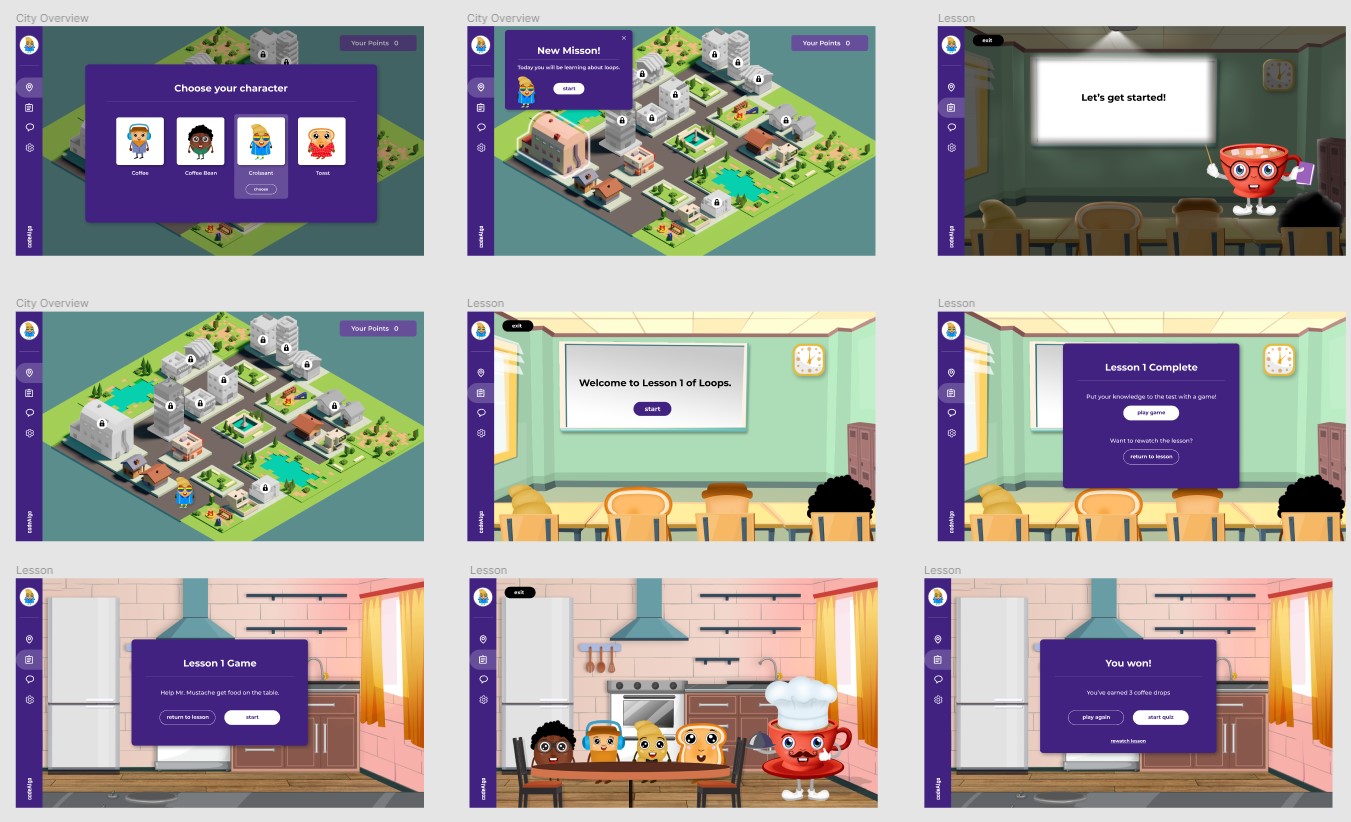
Our UX team was tasked with creating an MVP of the CodeAlgo Academy's Teacher Dashboard in order for our clients to attract potential investors. Moreover, they wanted us to redesign their demo for the Students portal.
Goal
Our goal was to understand what computer science teachers exactly need in the Teacher's Dashboard, and create an MVP of both the Teacher's Dashboard and the Student Portal.
Research
1. Competitive Analysis
2. User Research
3. Affinity Mapping
Competitive and Comparative Analysis
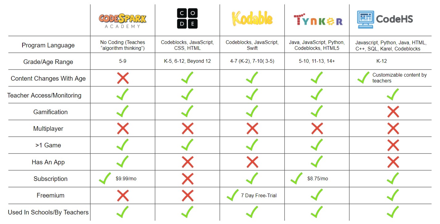
After understanding our app of course comes the analysis of our competition. To do so, we came up with a chart that compares the features of our app and features within our direct (e.g. Paired) and indirect (e.g. Calm) competitors.
User Research
We interviewed a few Evergreen users and others who had not used the app but frequently listened to podcasts on self-growth and relationships.
Here are some examples of the questions we asked them:
Affinity Mapping
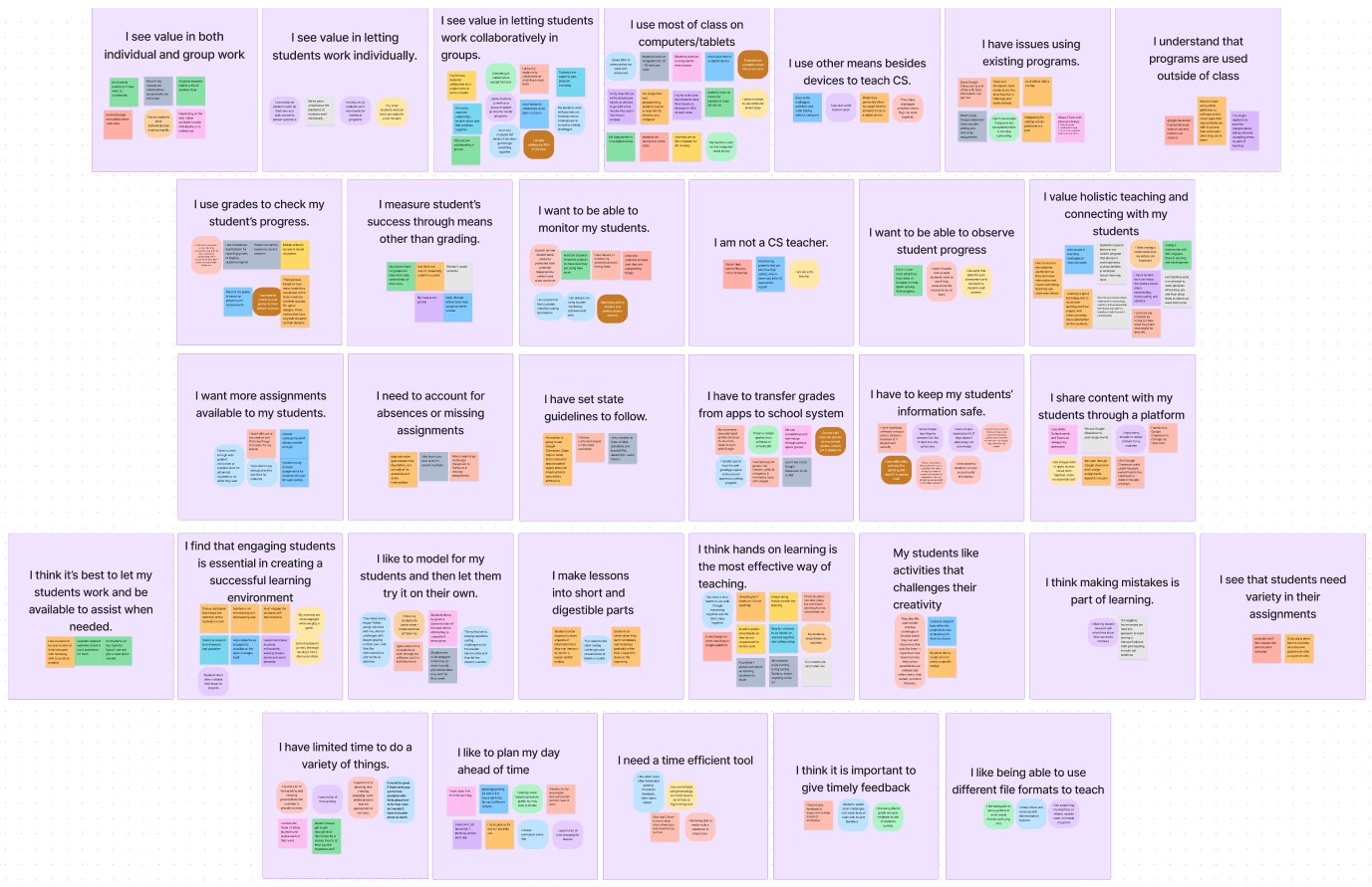
As a result of our research, we made an Affinity Map and after 40 minutes of collaboration we came up with the following "I Statements".
Define
1. Persona
2. Problem Statement
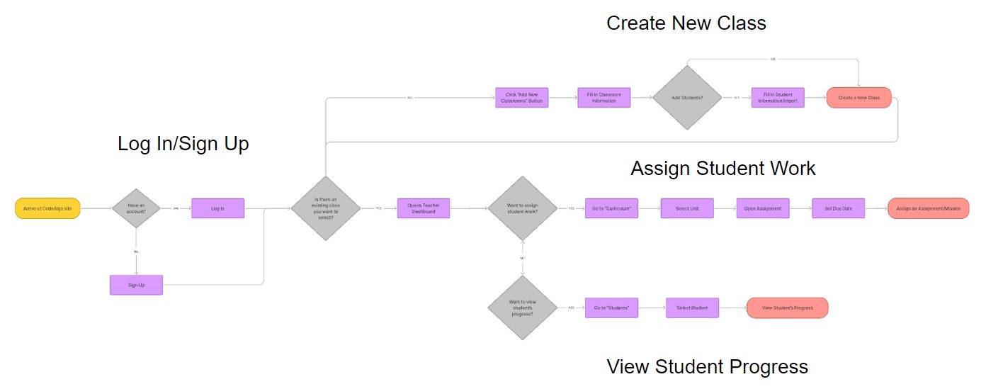
3. User Flow
Persona
User Flow
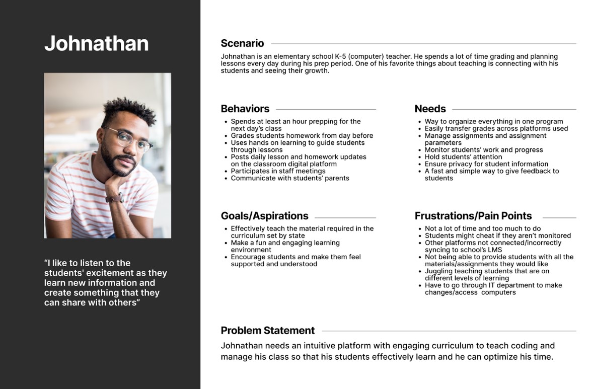
Tyler needs a way to access relatable and reputable relationship podcasts through the Evergreen app so that in addition to engaging in activities and games, Tyler can continue to support his goal of growing his relationship with his partner.
Design
1. Sketch
2. Wireframe
3. Usability Testing
4. Prototype
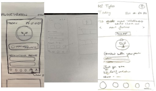
Sketches
Design System
We used the Design System to come up with our sketches and ideate the layout of the app. Meaning we only spent 5 minutes sketching a rough draft of a page, then we would critique our sketches as a team for 10 minutes. Finally, we would iterate and finalize our sketches for a page for 20 minutes
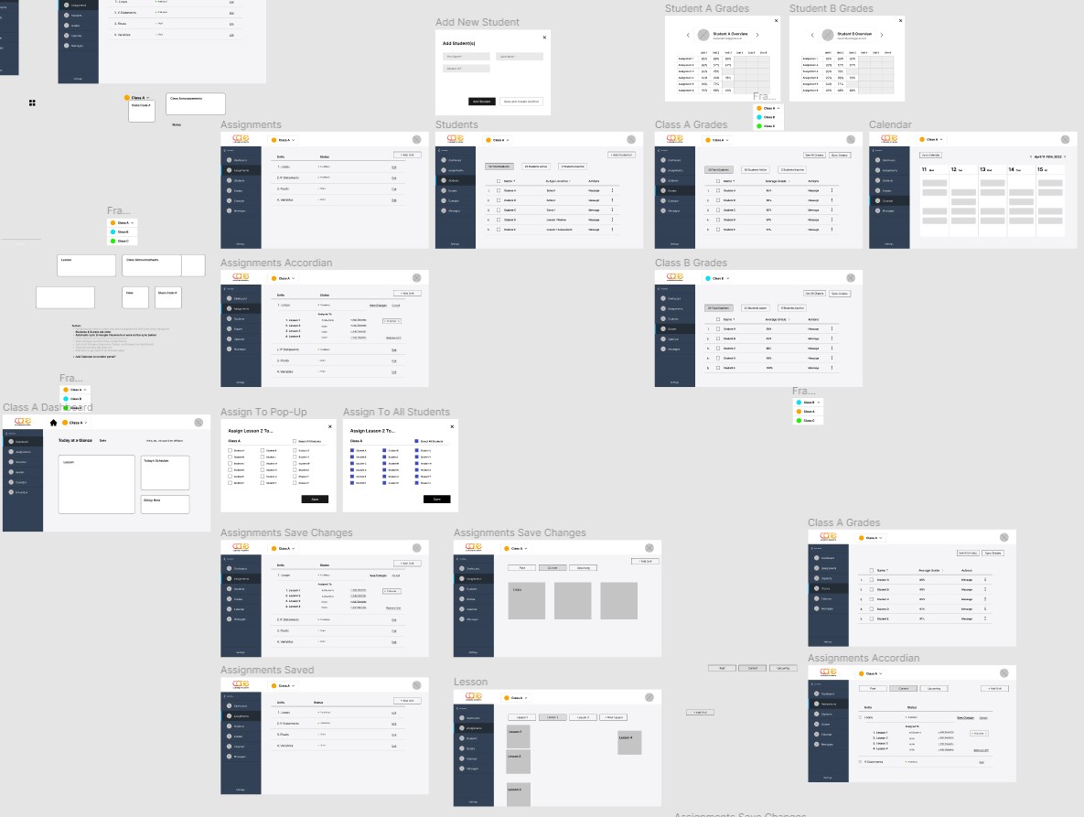
Wireframe
Usability Testing
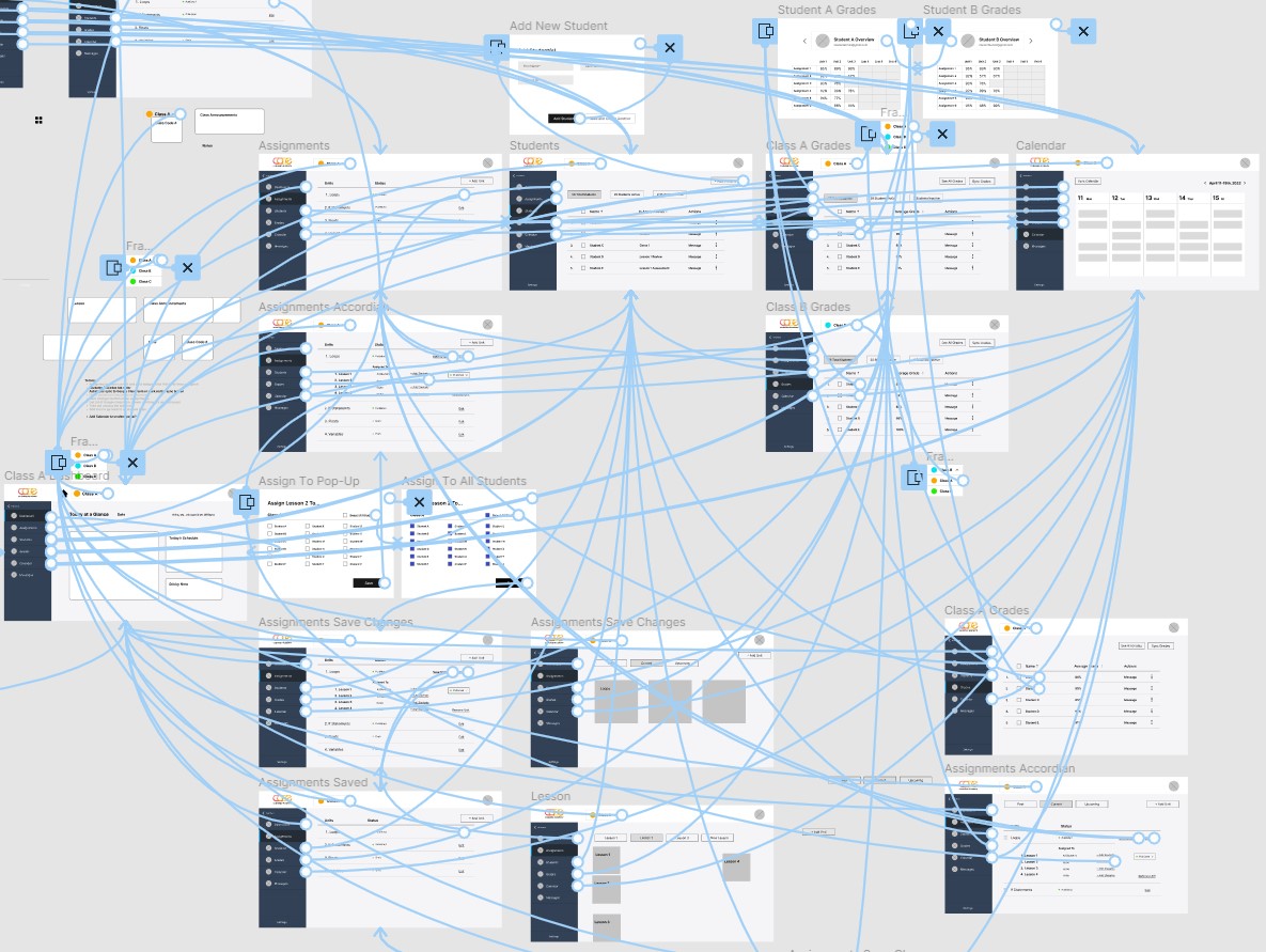
Using our wireframes we made an interactive prototype, to test the functionality of our design. We explained to our users that we are not looking for feedback on the looks of the prototype but rather its functionality.
Insights
- Users were able to find the podcast episode given in the task.
- Users found it confusing returning back to the home page, they felt lost and came across a page they weren’t before.
- Users missed the experience of knowing the episode number they were listening to like other podcast apps.
- Users found it confusing to use back twice to reach bottom navigation, wished for an easier way to reach.
- Users took a while to find favorite episodes but eventually found them.
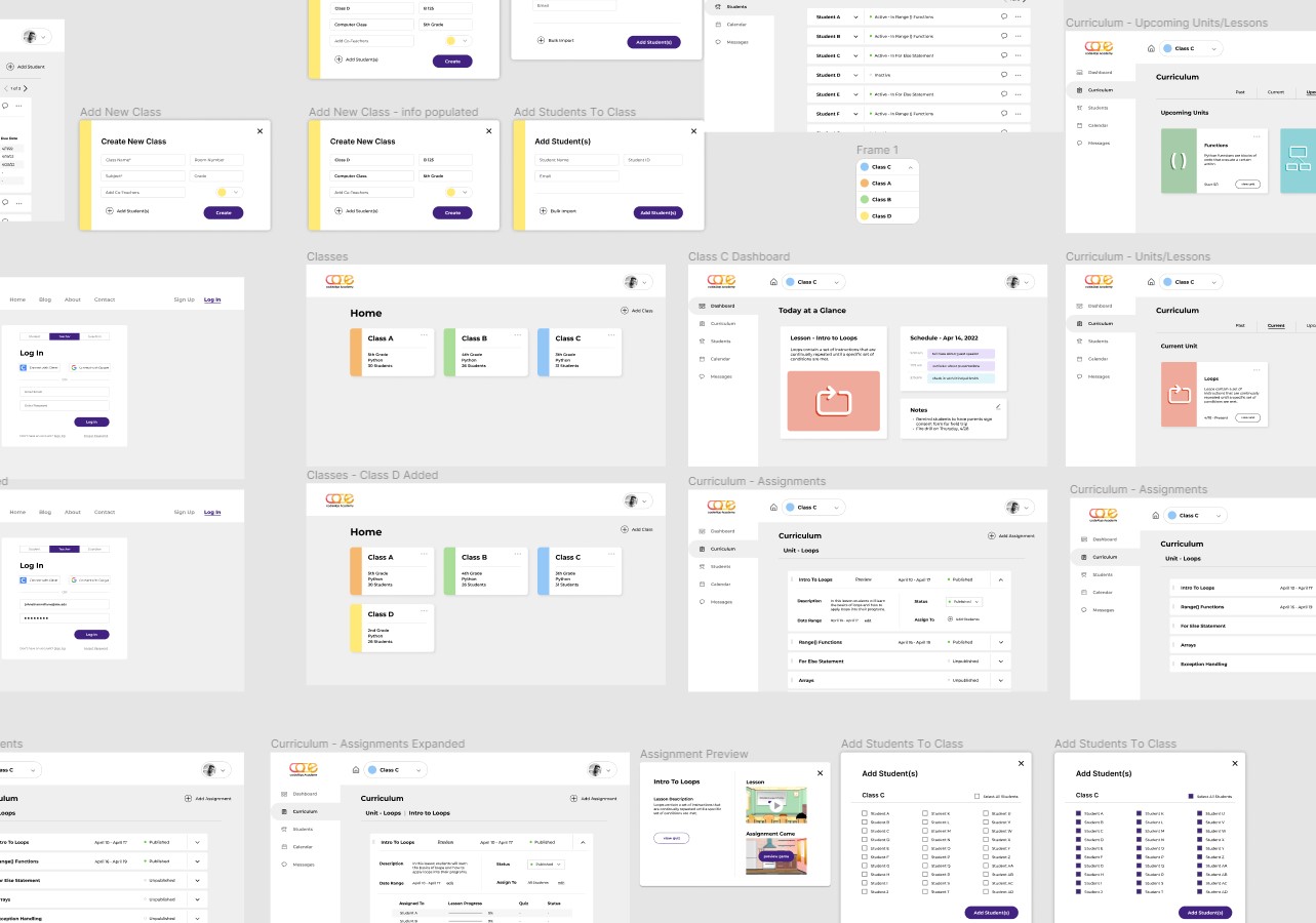
Prototype
We iterated on our insights and built our prototype using Figma. Each person was in charge of 2 pages while working on the elements on each page together.
Next Steps
- Conduct more user interviews
- Students
- Teachers
- Parents
- Build out students' and parents' side of the website
- Usability testing with more teachers
- Further build out functionality and wireframes
- Once the final curriculum is made, implementing that onto the website
- Designing for a more specific program and age range