Evergreen
App
Evergreen app
Overview
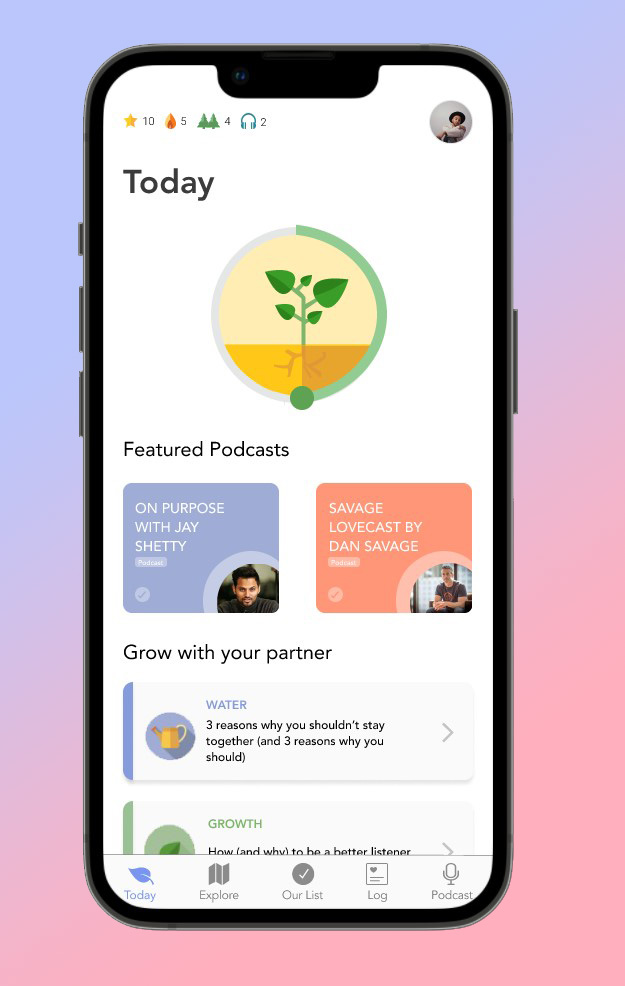
The Evergreen app is a self-paced self-guided relationship growth app. Evergreen offers lessons and quiz games on dating and relationships which couples can do together to better understand their partners and to reflect on their behaviors.
UX Team
Hamed Emari - UX Designer
Callie Waldman - UX Designer
Parita Shah - UX Designer
Role
UX Designer
Initial Problem
Our UX team was tasked with adding a new feature to the Evergreen app for the next update of the app. The new feature had to visually and functionally match the current app.
Goal
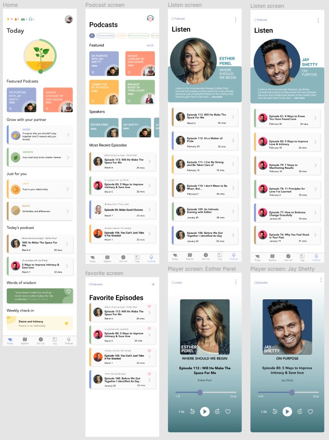
Our goal was to integrate a Podcast feature on the Evergreen app, as the goal of Evergreen is to expose couples to a variety of subjects on dating and relationships.
Research
1. Understand Evergreen
2. Competitive Analysis
3. User Research
4. Affinity Mapping
Understand Evergreen
The goal of the Evergreen app is to expose couples to different topics on dating and relationships so couples can understand their partner's behaviors and reflect on themselves and their actions. And podcasts can effectively introduce these topics to Evergreen users. Moreover, users can listen to podcasts on their own time, similar to the self-paced lessons on Evergreen.
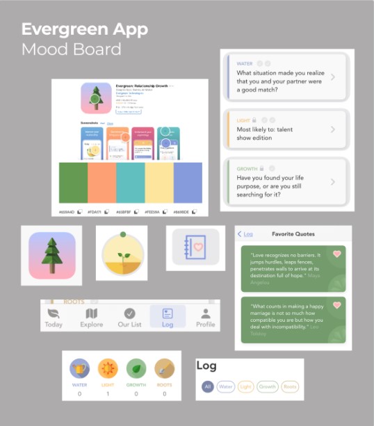
Mood Board
Evergreen has a variety of icons and colorful elements. To better familiarize ourselves with the zeitgeist of the app we created a Mood Board.
Competitive and Comparative Analysis
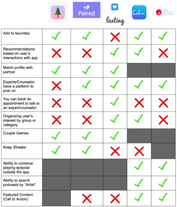
After understanding our app of course comes the analysis of our competition. To do so, we came up with a chart that compares the features of our app and features within our direct (e.g. Paired) and indirect (e.g. Calm) competitors.
User Research
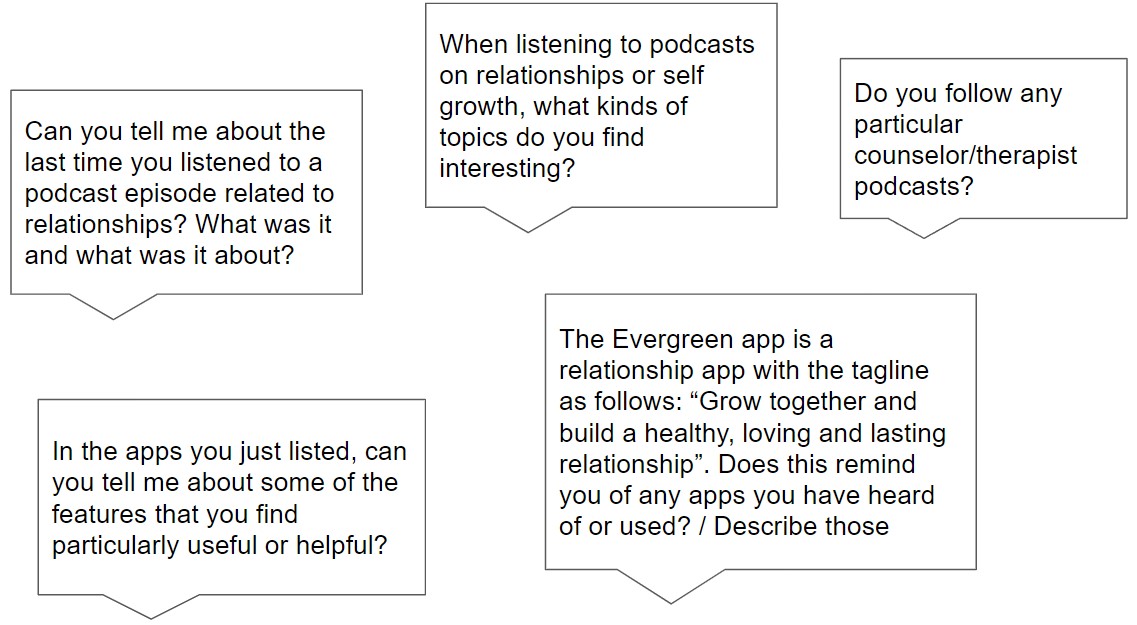
We interviewed a few Evergreen users and others who had not used the app but frequently listened to podcasts on self-growth and relationships.
Here are some examples of the questions we asked them:
Affinity Mapping
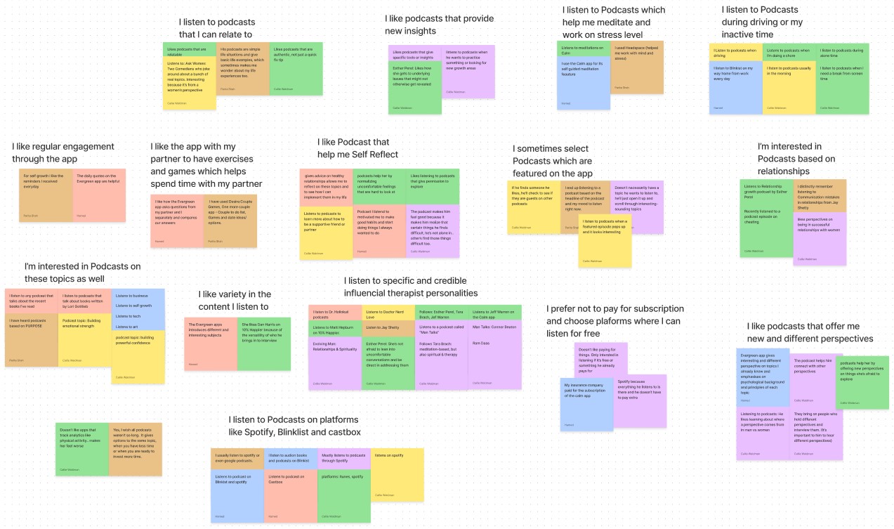
As a result of our research, we made an Affinity Map and after 40 minutes of collaboration we came up with the following "I Statements".
Define
1. Persona
2. Problem Statement
3. User Flow
Persona
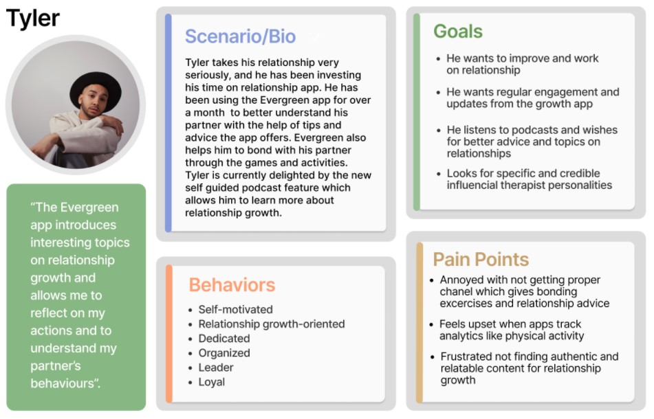
From our Affinity Map, we created Tyler!
Tyler is our primary persona, a regular user of the Evergreen app. He and his partner engage in the app’s games, activities and discussion prompts, he’s committed to growing and getting deeper in his relationship.
Problem Statement
Tyler needs a way to access relatable and reputable relationship podcasts through the Evergreen app so that in addition to engaging in activities and games, Tyler can continue to support his goal of growing his relationship with his partner.
User Flow
At this point in the project, we were brainstorming on ways to address Tyler's problem and create a user flow that best solves his problem and allows him to listen to his favorite podcasts while keeping the integrity and the feel of the Evergreen app.

Since Tyler has been using the Evergreen app for a while, he is more familiar with the app's interface and uses the bottom navigation to look for podcasts.
Design
1. Sketch
2. Wireframe
3. Usability Testing
4. Prototype
Sketches
Design System
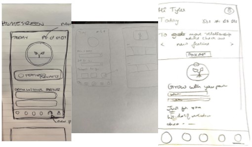
We used the Design System to come up with our sketches and ideate the layout of the app. Meaning we only spent 5 minutes sketching a rough draft of a page, then we would critique our sketches as a team for 10 minutes. Finally, we would iterate and finalize our sketches for a page for 20 minutes
Wireframe
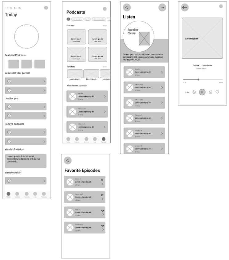
As per our team agreement, we have been working on everything together, and Wireframes were no different. With teamwork, we turned our sketches into grayscale using Figma in half a day.
Usability Testing
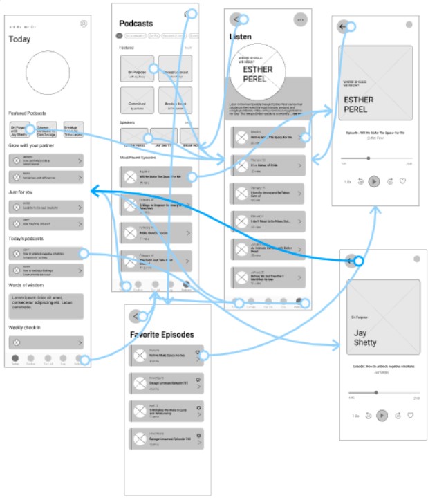
Using our wireframes we made an interactive prototype, to test the functionality of our design. We explained to our users that we are not looking for feedback on the looks of the prototype but rather its functionality.
Insights
- Users were able to find the podcast episode given in the task.
- Users found it confusing returning back to the home page, they felt lost and came across a page they weren’t before.
- Users missed the experience of knowing the episode number they were listening to like other podcast apps.
- Users found it confusing to use back twice to reach bottom navigation, wished for an easier way to reach.
- Users took a while to find favorite episodes but eventually found them.
Prototype
We iterated on our insights and built our prototype using Figma. Each person was in charge of 2 pages while working on the elements on each page together.

Usability Testing #2
We conducted a usability test of high fidelity prototype with 7 users and gave them similar tasks from our usability of mid-fidelity.
Insights
- Users faced a bug in the navigation flow while clicking on the bottom navigation from the podcast screen, it took them to the player screen.
- Users found visual familiarity with the existing app, liked how the podcast screen is in sync with the other screens of the app.
Next Steps
- Make the podcast feature more functional. (add settings, show the player being played even after coming out of the player screen)
- Add animation of headphones to the favorite icon in the player screen.
- Usability testing one more round with users using the podcast feature, to understand their needs.